For the final assignment in week five of the Coursera MOOC I just completed, Maps and the Geospatial Revolution, we were tasked with creating a map that tells a story. Following on from the discussion I’d had with my classmates in week four, I decided to make the series of maps I’d talked about in the discussion, showing trends in human-shark interactions through time. I downloaded the entire International Shark Attack File database for South Africa from SharkAttackFile.info, and some census data from Statistics South Africa. I used the census data to normalise the ISAF data, so that we can look at rates of interaction and account for increasing coastal populations.


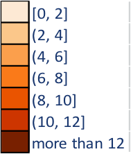
This series of maps shows the number of interactions (fatal and non-fatal, including bites, nudges, etc) between humans and sharks for each decade between 1951 and 2010, as well as the rate of interactions per million people. Its purpose is to determine
- whether the widely-held perception in South Africa (and in the Western Cape province particularly) that shark attacks are increasing unchecked, is correct;
- and whether the frequently-provided partial explanation, that increasing coastal populations – putting more people in the water and in the home of sharks – explains the perceived increase or not.
I think these maps are an improvement over the ISAF map for South Africa for a couple of reasons:
- We can spot trends through time, which a single, static map does not allow.
- The ISAF data quality has probably improved over the years, and plotting data from 1905 and 2005 on the same map is questionable. At least this way we can just look at the most recent maps if we want to know what things look like right now.

From the map series above, you can see that the number of encounters between humans and sharks each decade has remained fairly constant. A naïve reading of the data would suggest that there have been no advances in mitigating the risk of a shark bite. However…
The rate of encounters per decade (normalising the data for increasing coastal populations and water use – orange maps below) has mostly been decreasing, after peaking in 1970. In KZN, this can probably be attributed to increased shark netting at swimming beaches. In Cape Town, the Shark Spotters program (started in 2004) warns swimmers out of the water when a white shark is spotted near the backline of the surf, and notifies them when it is safe to return to the water. In the last 25 or so years scientific research has also shed light on the conditions that sharks tend to prefer, enabling water users to avoid the water at these times.
The water temperature off the Western Cape ranges from 10 to 22 degrees celcius, while off KwaZulu Natal (KZN) it varies between 20 and 25 degrees with the seasons. Warmer water temperatures draw more people into the water, where they meet sharks. For the first 40 years of my data set KZN has a relatively high rate of shark encounters because all it took was a bathing suit to enjoy the ocean there. The Western Cape only caught up to KZN with respect to human-shark interactions once thermal protection from wetsuits became commonplace and more affordable in the 1970s, and people were able to stay in the water for longer.
There is a lot of natural variation in the numbers. Detecting firm trends in time series derived from an ecosystem is tricky, as many factors influence the process under observation. Great white sharks have been protected in South Africa since 1994, but because there was no known baseline population figure for the animals at that stage, it is difficult to assess whether there has been an increase in shark numbers as well as bathers. The presence of a whaling station in Durban, that closed in 1975, probably also contributed to numbers of sharks close to the Durban beachfront (attracted by the offal that was pumped out into the ocean in front of the Bluff) that were larger than there would be otherwise.
Finally, the likelihood of you meeting a shark while in South African waters (unless you go out of your way to, on a cage or baited dive) is very, very small. The most recent numbers put it at a less than six in a million chance over ten years. We dramatically overestimate the risk of a shark incident, because they are so emotive and fear-inducing.
If you want to see these maps laid out nicely in sequence, click here to download a pdf of my assignment. It’s easier to follow, I promise!


