How was your summer? Can you recall it? We are far enough into winter that it feels like quite a distant memory, but the summer months of 2014-2015 in Cape Town were memorable for all the wrong reasons! It felt like an endless series of windy days, and we were not able to go diving nearly as often as we’d have liked. South easterly gales raged for weeks on end. Most days boat diving was out of the question, and shore diving was iffy. When the wind stopped, the visibility was appalling. Needless to say the frustration levels of Sun Valley’s resident dive boat skipper were high.
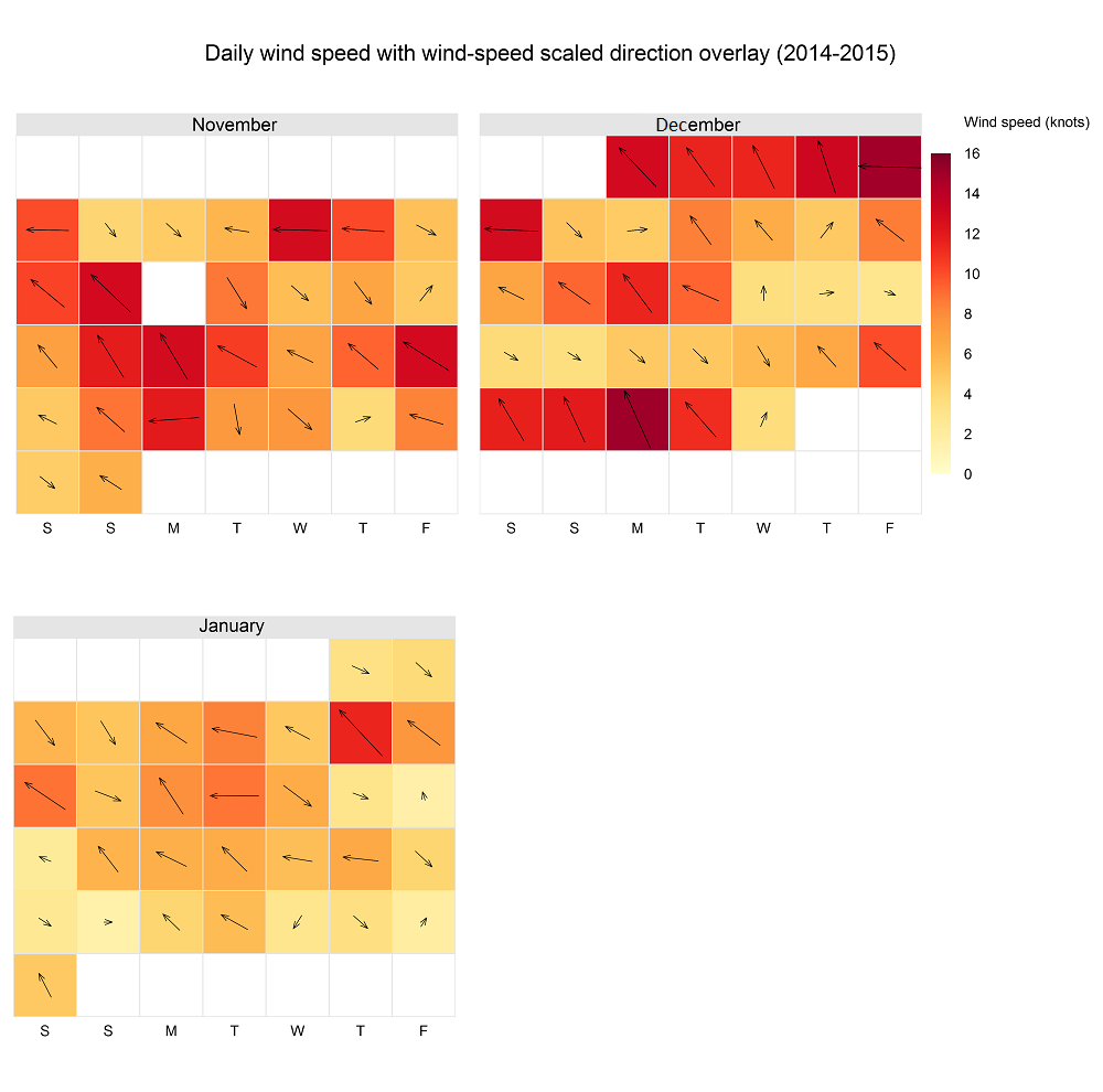
Looking back at what our weather station recorded during this time, it’s clear that the feeling of experiencing endless windy days was not an illusion. These two charts of the wind data from November to the end of January are in knots – to remind you, a wind speed of 10 knots = 18.52 kilometres per hour.
The chart below shows the wind speed and direction for each day in November to January that our weather station recorded data. The wind speed is illustrated in two ways (a bit of redundancy, but easy to read): the colour of each block, and the length of the direction arrow inside the block. So, for example, the first Friday in December (top right hand corner of the December block) was a very windy day from the east.

You can observe several things above. One is that many, many days had average wind speeds of over 10 knots, at which point it is already getting a bit uncomfortable on the boat and tricky/risky fishing divers out of the water. The other is how dramatically the wind started to drop off at the end of January. (If you are wondering why the charts end when they do, the bearing in our Oregon Scientific anemometer packed up mid-February and so that month has a bit of missing data while we waited for a replacement unit!)

The same trend is visible in this chart, which shows the average wind speed each day from November to end January (the red line), and an envelope around it showing the maximum wind speed on that day, and the minimum (which was, at times, zero knots).
Summer is the windiest time of the year in the Cape – refer to my post on wind trends for 2014. Even though it’s colder, we are relieved to be in a season of lighter winds that come from favourable directions (in the north to west quadrant) for False Bay.
A note on the graphs
I discovered calendar plots on Jason and Doug’s Penang weather blog, which is heaven for visualisation and weather nerds. The calendarPlot function is part of the R openair package. And here’s the code for the line chart, using ggplot2:


